Visa Product Design System
Develop experiences for everyone, everywhere.
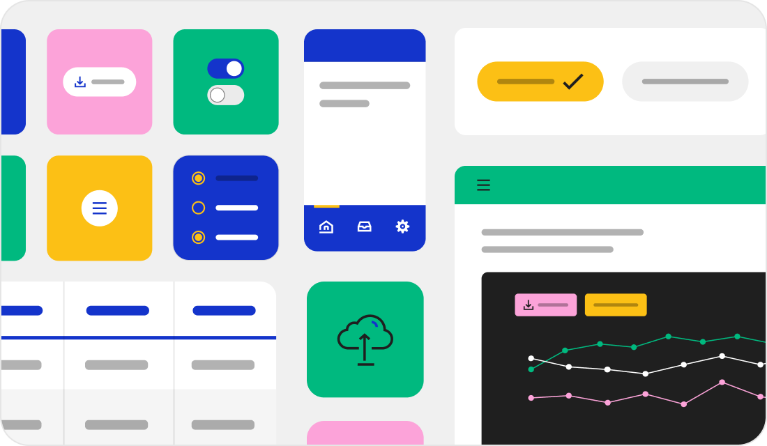
VPDS is the Visa Product Design System—a comprehensive framework with everything you need to create accessible and scalable experiences for everyone, everywhere. Start using VPDS components, patterns, and guidelines to take your products from step one to done.
Implement fast. Improve forever.
Component libraries
Build rapidly with ready-to-use code snippets and APIs for 40+ components. Ensure your product is built for users across the globe with pre-tested examples that meet the latest WCAG 2.2 A and AA standards.
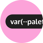
Design Tokens
Customize easily with variables that define key elements like color, elevation, and icons. Modify them directly in the code for seamless integration, ensuring consistency across your projects.
Base elements
Simplify standardization and maintenance. By using accessibility-tested assets like typography, spacing, and color, keeping your experience aligned with current Visa brand standards.
Comprehensive documentation
Access tailored documentation for Angular, Flutter, React, and CSS. Kick start implementation with get started guides and to stay up-to-date on the latest bug fixes and updates with comprehensive changelogs.
Empower your team. Elevate your product.
Accessible by design.

- Built-in VGAR compliance, meeting WCAG 2.2 A and AA standards.
- Designed with inclusivity as a foundational principle.
- Regularly tested and updated to align with the latest standards.
Consistency at each step.
- 50+ scalable components and patterns aligned with the Visa brand.
- Consistent performance across platforms and products.
- Regularly updated to meet the latest brand standards and industry trends.
Adaptable across platforms.
- Development libraries for React, Angular, Flutter and Styles (CSS).
- Design tokens that enable theming across experiences.
- Comprehensive documentation to help developers get started easily.
Built for global impact.
- Flexible frameworks for diverse regional needs.
- Support for left-to-right and right-to-left languages.
- Content guidance for various date, time, and currency formats.
Start developing with VPDS
Styles (CSS)
Develop applications using native browser technologies with our HTML/CSS components.
React
Develop responsive and interactive web applications with our React components.
Angular
Harness the power of Angular to build dynamic, high-performance applications.
Flutter
Elevate your mobile and web apps with components designed to provide a native-like experiences.
Related VPDS guidelines
Accessibility guidelines
Check out development and testing practices that can help to ensure people of diverse abilities can use and interact with our digital products and tools.
Content guidelines
Explore our content guidelines to craft thoughtful and consistent interface content for a well-designed user experience.
Data visualization guidelines
Discover foundational principles and techniques for visualizing and communicating insights including data visualization principles.