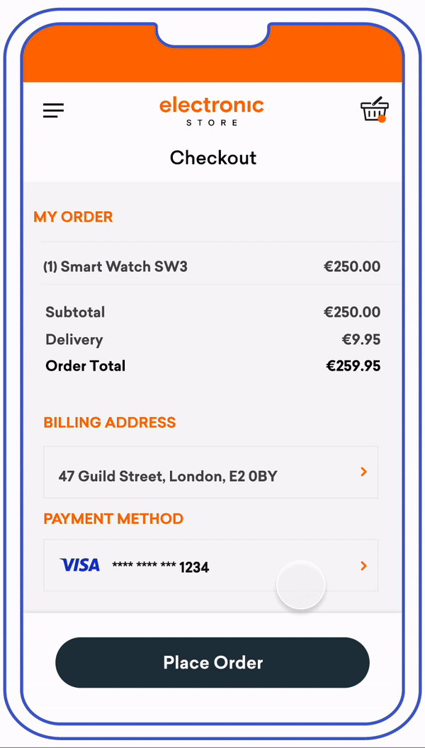
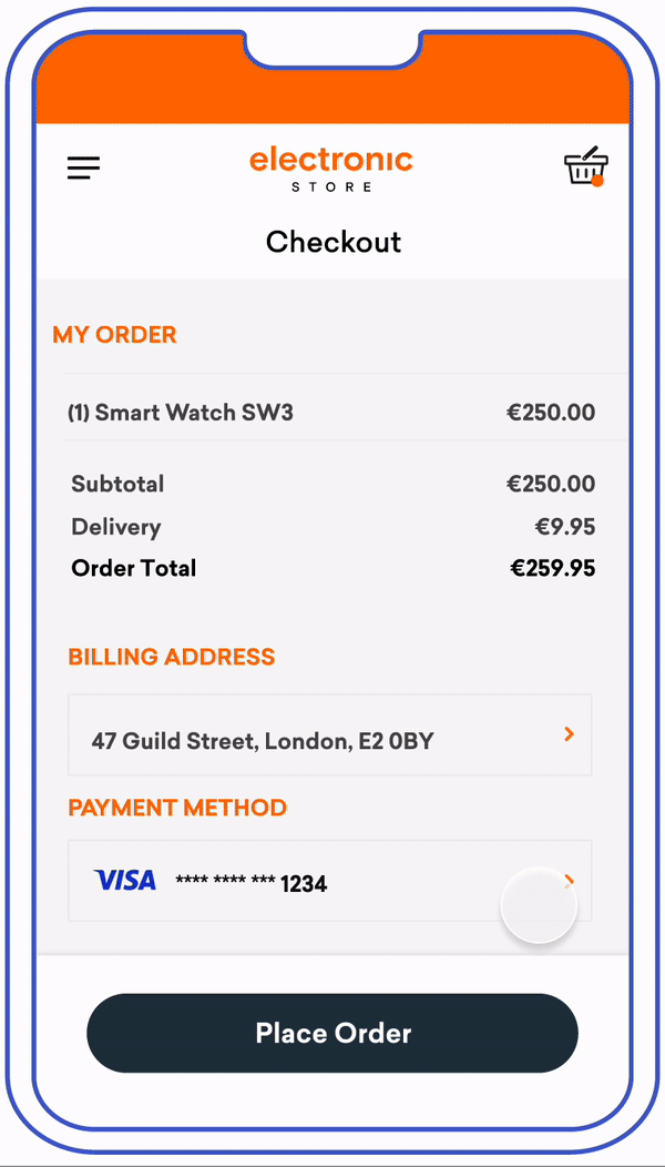
Out of Band (OOB)
Users verify transactions in their issuer’s authentication service. Issuers can choose which service to make available for user OOB authentication, such as authentication through the issuer’s mobile application.
In-app native challenges are built with 3DS SDK templates for a streamlined experience that matches the merchant’s native user interface. The guidelines in this section account for the technical specifications of the 3DS SDK, which are slightly different to the technical specifications of the HTML user experience.
HTML based challenges allow for greater issuer flexibility in designing the challenge experience. We have included three sections in our guidelines to specifically address the UX of HTML challenges for in-app, mobile browser and desktop browser experiences. HTML based challenges allow issuers to:
- Use rich text for the challenge instruction screens
- Allow users to choose a backup authentication method should they not be able to complete OOB authentication
In both experiences, it is highly recommended that issuers send users a push notification to their OOB authentication service upon showing users the OOB challenge information text. This has been shown to improve the user experience by giving users a direct route to their issuer’s OOB authentication service, as opposed to manually navigating to it.
Mobile In-App Native
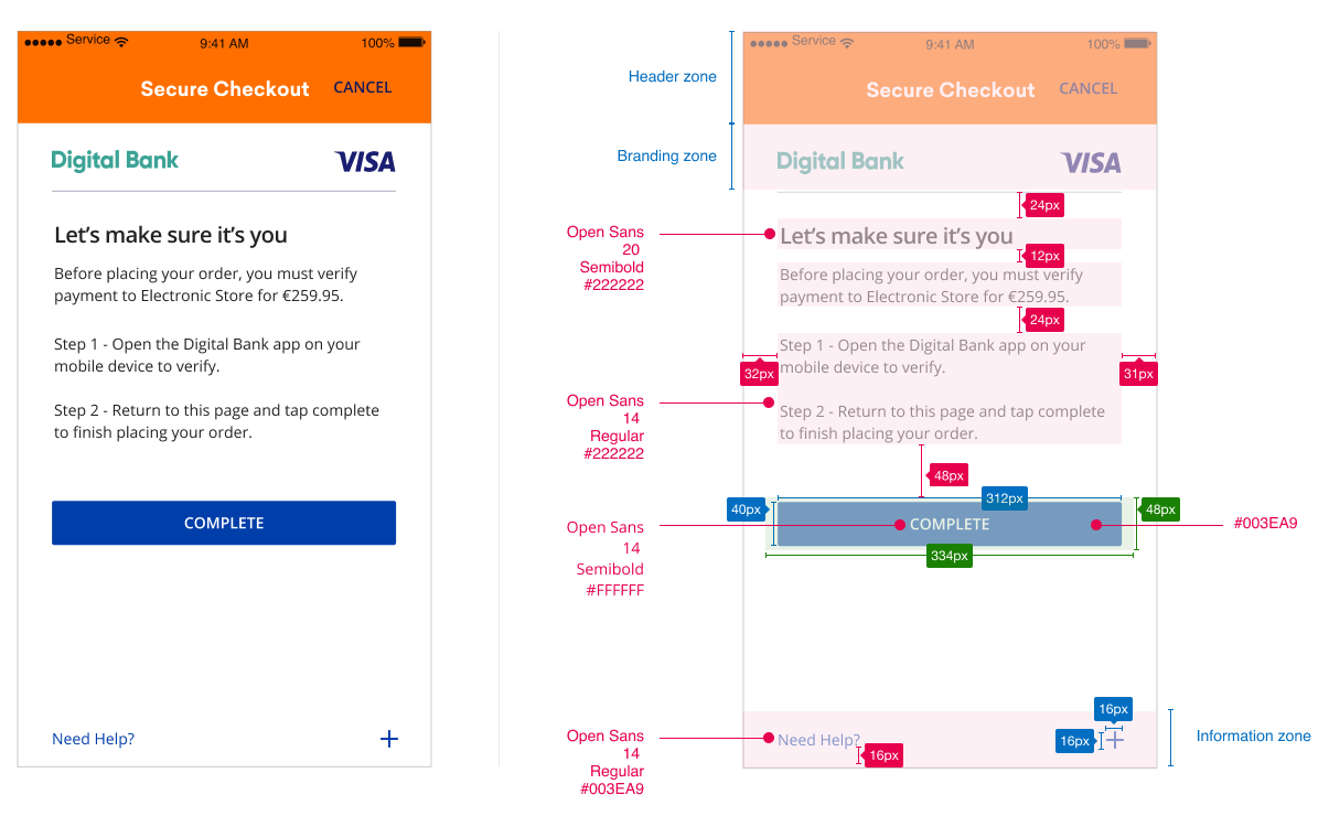
UX Elements
Element |
Code/Requirement |
CSS Styling |
|---|---|---|
Challenge Info Header |
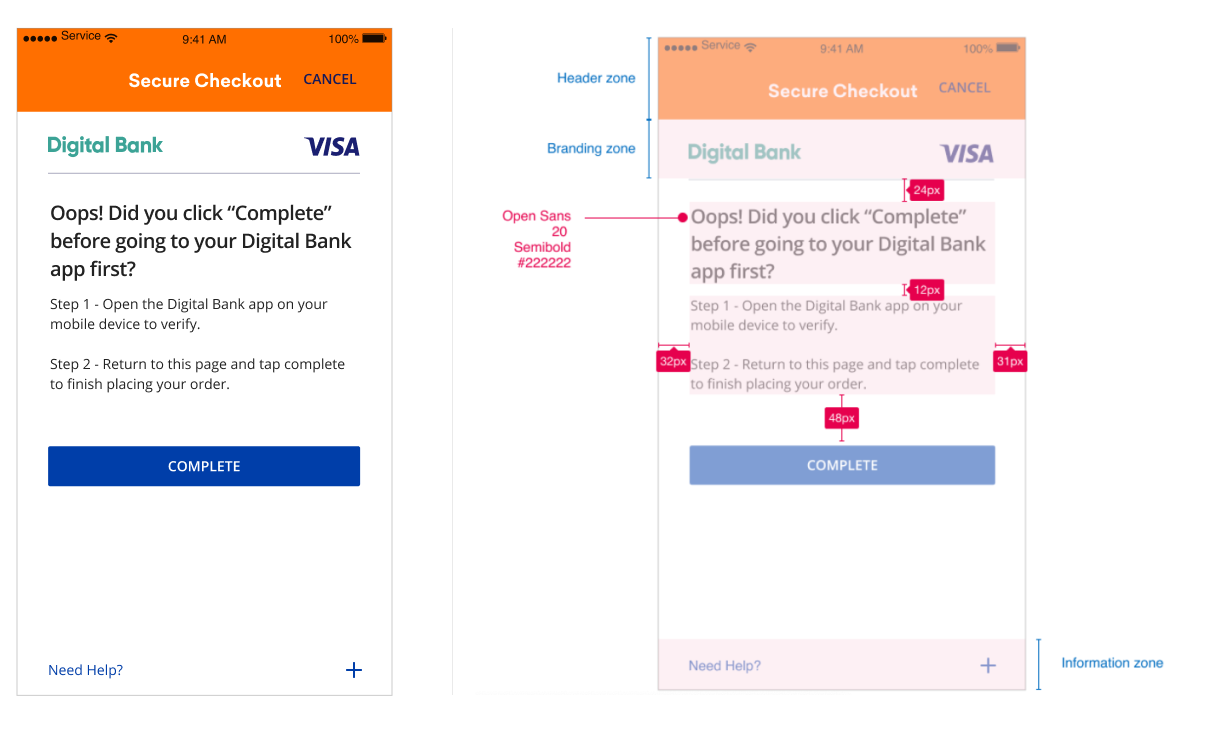
The page must display the headline Let’s make sure it’s you above the Challenge Info text. |
|
Challenge Info Text |
This text must include the following language: Before placing your order, you must verify payment to [Merchant] for [Amount]. Step 1 - Open the [Issuer] app on your mobile device to verify. Step 2 - Return to this page and tap complete to finish placing your order. |
|
Submit Authentication Label |
A form element that should align with the center of the bottom margin displaying “Complete”. |
|
Why Information Label |
Display the Why Information Label as a graphical control element that can be expanded. The display name for this field must be ‘Need Help?’. |
|
Why Information Text |
Display the Why Information Text only when the user selects the “Need Help? Label”. Text provided by the Issuer to be displayed to the cardholder to explain why the cardholder is being asked to perform the authentication task. |
|
Mobile In-App HTML
View PDF of screens seen in this full flow here
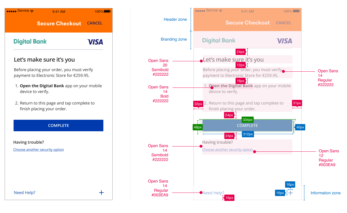
UX Elements
Element |
Code/Requirement |
CSS Styling |
|---|---|---|
Challenge Info Header |
The page must display the headline Let’s make sure it’s you above the Challenge Info text. |
|
Challenge Info Text |
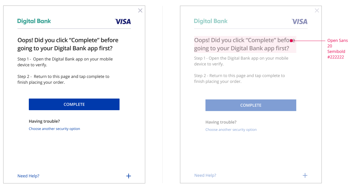
This text must include the following language: Before placing your order, you must verify payment to [Merchant] for [Amount]. 1. Open the [Issuer] app on your mobile device to verify. 2. Return to this page and tap complete to finish placing your order. The usage of rich text ordered lists is recommended so that users can clearly understand the authentication steps. |
|
Submit Authentication Label |
A form element that should align with the center of the bottom margin displaying “Complete”. |
|
Backup Authentication Method Text |
This text must include the following language: Having Trouble? |
|
Backup Authentication Method Label |
A form element that should align with the left side of the bottom margin displaying “Choose another security option”. |
|
Why Information Label |
Display the Why Information Label as a graphical control element that can be expanded. The display name for this field must be ‘Need Help?’. |
|
Why Information Text |
Display the Why Information Text only when the user selects the “Need Help? Label”. Text provided by the Issuer to be displayed to the cardholder to explain why the cardholder is being asked to perform the authentication task. |
|
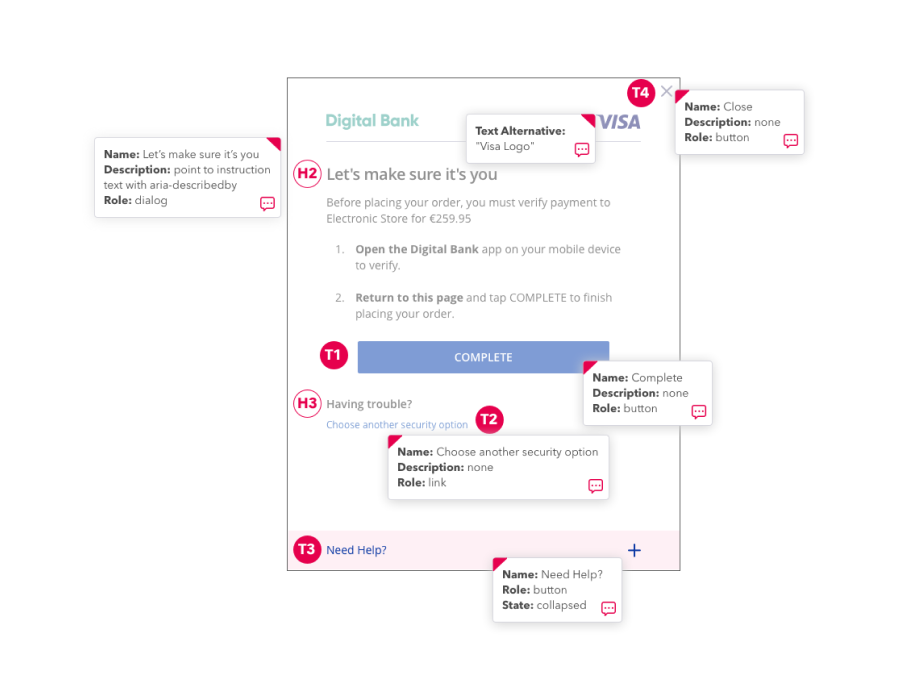
Desktop Browser HTML

Element |
Accessibility Guidelines |
|---|---|
Challenge Info Header |
|
Visa Logo |
|
Submit Authentication Label |
|
Use Another Method |
|
Need Help Field |
|
Close Screen |
|
UX Elements
Element |
Code/Requirement |
CSS Styling |
|---|---|---|
Challenge Info Header |
The page must display the headline Let’s make sure it’s you above the Challenge Info text. |
|
Challenge Info Text |
This text must include the following language: Before placing your order, you must verify payment to [Merchant] for [Amount]. 1. Open the [Issuer] app on your mobile device to verify. 2. Return to this page and tap complete to finish placing your order. The usage of rich text ordered lists is recommended so that users can clearly understand the authentication steps. |
Open the [Issuer] app
|
Submit Authentication Label |
A form element that should align with the center of the bottom margin displaying “Complete”. |
|
Backup Authentication Method Text |
This text must include the following language: Having Trouble? |
|
Backup Authentication Method Label |
A form element that should align with the left side of the bottom margin displaying “Choose another security option”. |
|
Why Information Label |
Display the Why Information Label as a graphical control element that can be expanded. The display name for this field must be ‘Need Help?’. |
|
Why Information Text |
Display the Why Information Text only when the user selects the “Need Help? Label”. Text provided by the Issuer to be displayed to the cardholder to explain why the cardholder is being asked to perform the authentication task. |
|
Premature Completion Requirements
In each of the device channels shown above, it is possible for users to click the “Complete” button prior to OOB authentication taking place. In the event that users click the “Complete” button prior to OOB authentication, it is recommended that issuers display a premature completion screen that adheres to the following guidelines so that users understand that they need to authenticate in their issuer’s OOB authentication service.
UX Elements
Element |
Code/Requirement |
CSS Styles |
|---|---|---|
Need Help Info Header |
The page must display the headline Oops! Did you click “Complete” before going to your Digital Bank app first? above the Need Help Info text. |
|
Need Help Info Text |
This text must include the following language: Step 1 - Open the [Issuer] app on your mobile device to verify. Step 2 - Return to this page and tap complete to finish placing your order. |
|
Submit Authentication Label |
A form element that should align with the center of the bottom margin displaying “Complete”. |
|
Why Information Label |
Display the Why Information Label as a graphical control element that can be expanded. The display name for this field must be ‘Need Help?’. |
|
Why Information Text |
Display the Why Information Text only when the user selects the “Need Help? Label”. Text provided by the Issuer to be displayed to the cardholder to explain why the cardholder is being asked to perform the authentication task. |
|
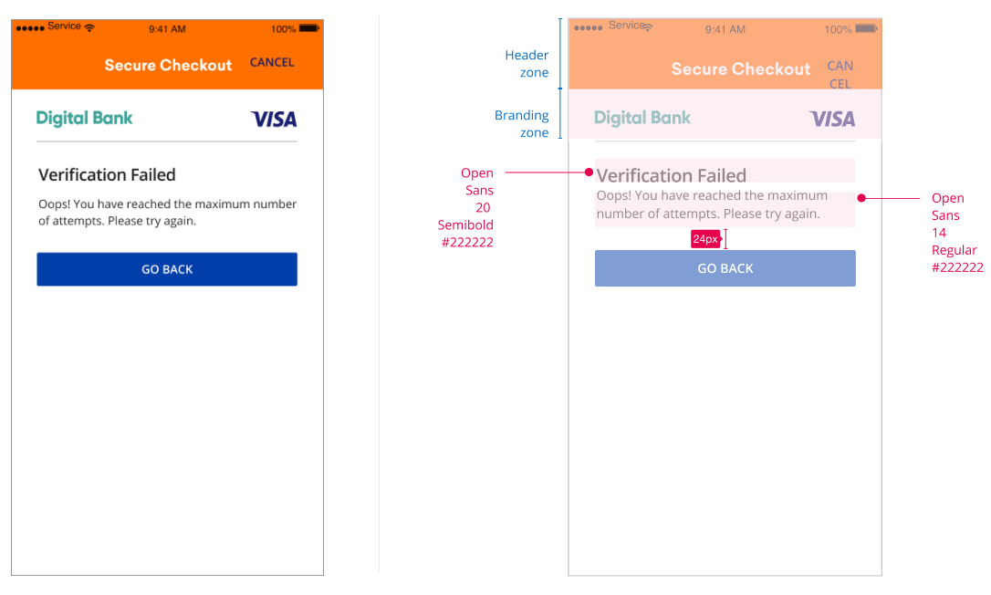
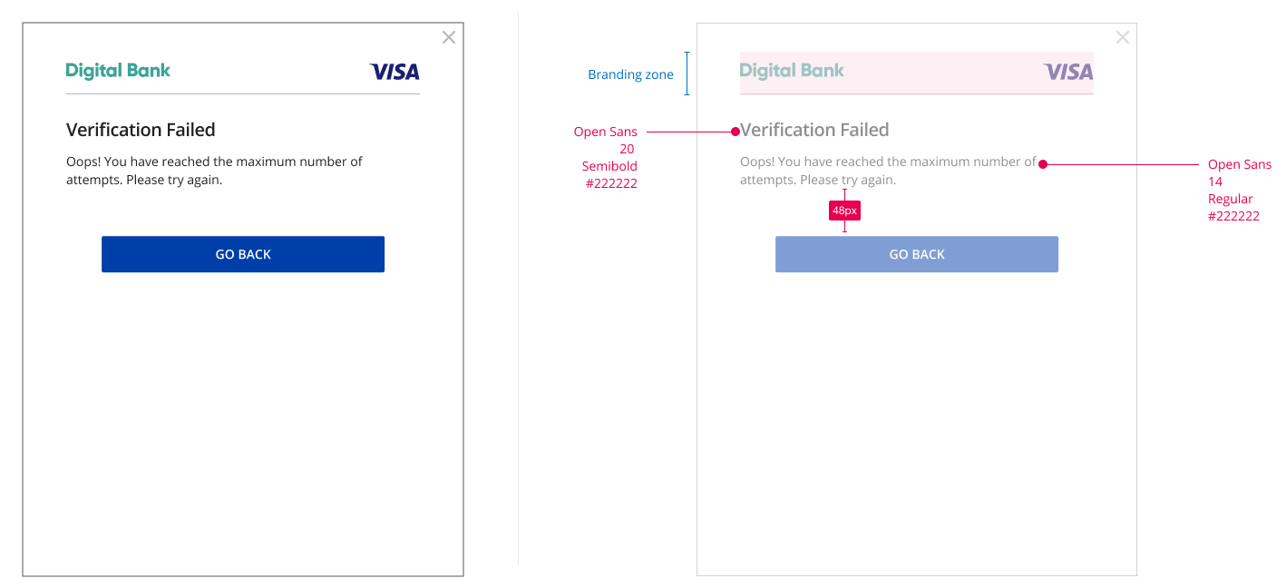
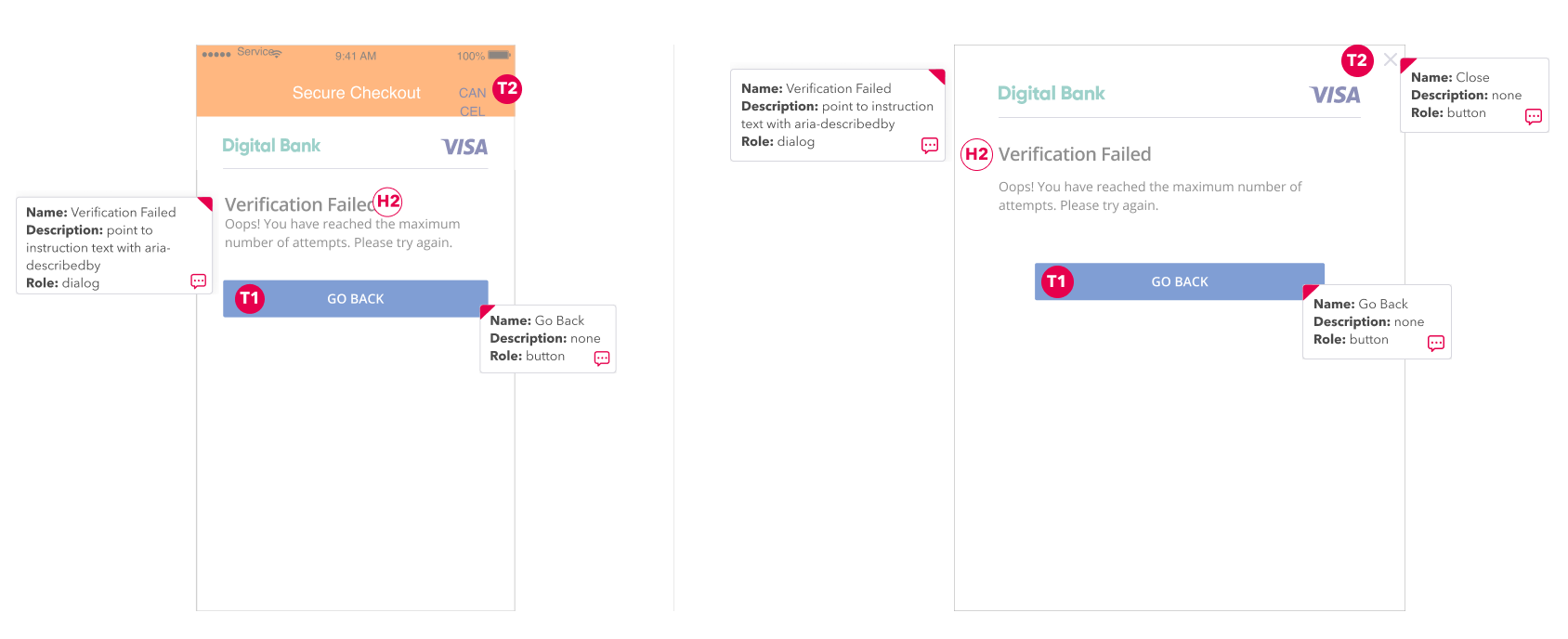
Error Flows
Element |
Accessibility Guidelines |
|---|---|
Challenge Info Header |
|
Close Window |
|
Go Back Label |
|
UX Elements
Element |
Code/Requirement |
CSS styles |
|---|---|---|
Challenge Info Header |
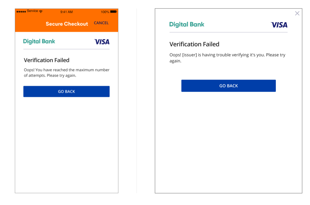
The page must display the headline Verification Failed above the Challenge Info text. |
|
Challenge Info Text |
Oops! [Issuer] is having trouble verifying it’s you. Please try again. |
|
Submit Authentication Label |
A form element that should align with the center of the bottom margin displaying “Go Back”.
This label closes the Challenge screen and routes user back to the previous screen |
|
Legal Disclaimer
Important Information on Copyright and Disclaimers
© 2022 Visa. All Rights Reserved
Notice: The trademarks, logos, trade names and service marks, whether registered or unregistered (collectively the “Trademarks”) are Trademarks owned by Visa. All other trademarks not attributed to Visa are the property of their respective owners, are used for identification purposes only and do not imply product endorsement or affiliation with Visa.
Note: This document is not part of the Visa Core Rules and Visa Product and Service Rules. In the event of any conflict between any content in this document, any document referenced herein, any exhibit to this document, or any communications concerning this document, and any content in the Visa Core Rules and Visa Product and Service Rules, the Visa Core Rules and Visa Product and Service Rules shall govern and control.
Note: Please note that the screens are for illustrative purpose only.
DISCLAIMERS: THIS DOCUMENT IS PROVIDED ON AN "AS IS,” “WHERE IS,” BASIS, “WITH ALL FAULTS” KNOWN AND UNKNOWN. TO THE MAXIMUM EXTENT PERMITTED BY APPLICABLE LAW, VISA EXPLICITLY DISCLAIMS ALL WARRANTIES, EXPRESS OR IMPLIED, REGARDING THE LICENSED WORK AND TITLES, INCLUDING ANY IMPLIED WARRANTY OF MERCHANTABILITY, FITNESS FOR A PARTICULAR PURPOSE, AND NON-INFRINGEMENT OF THIRD-PARTY INTELLECTUAL PROPERTY RIGHTS.