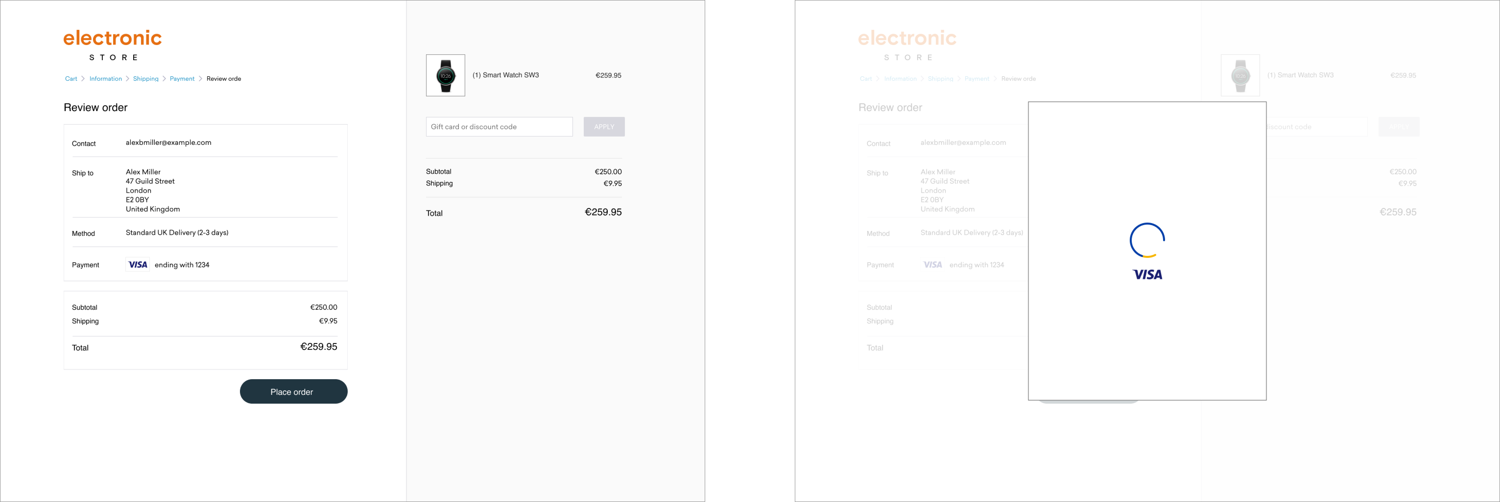
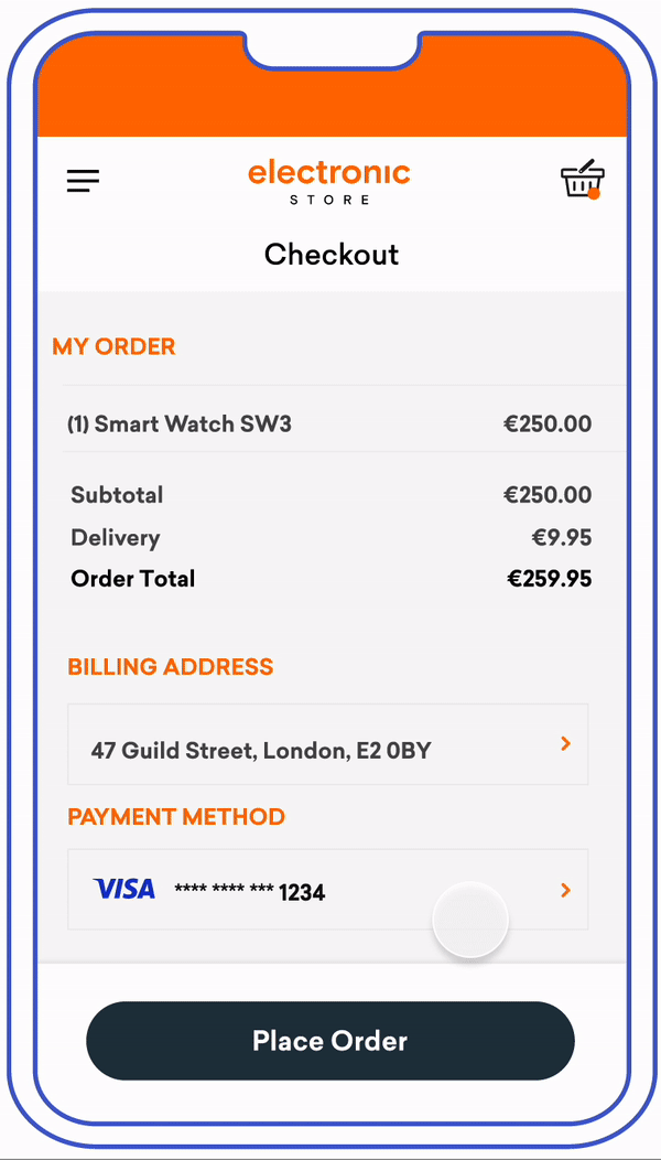
One-Time Passcode (OTP)
Customers verify transactions using a secure code sent by text or email. Issuers can choose which delivery channels to make available for the customer. We recommend providing both to the customer.
Mobile In-App Native
Customers verify transactions using a secure code sent by text or email. Issuers can choose which delivery channels to make available for the customer. We recommend providing both to the customer.

View PDF of screens seen in this full flow here
Element |
Accessibility Guidelines |
|---|---|
Logo |
|
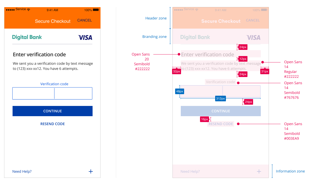
Challenge Information Text |
|
Submit Authentication Label |
|
Need help Field |
|
Passcode Entry Field |
|
Resend Information Label |
|
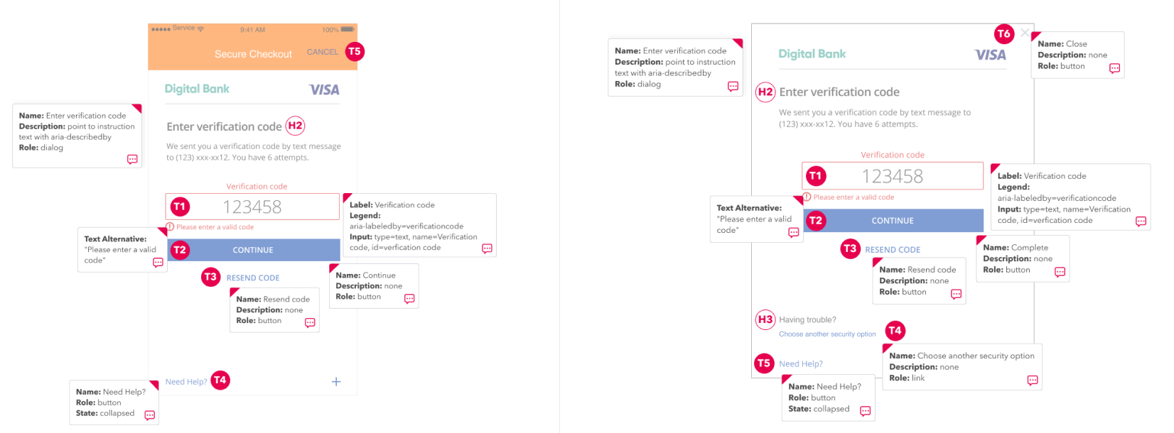
HTML - One Time Passcode Input Field
<div id="get-code-screen" class="screen" hidden>
<h2 class="semi-bold">Let's make sure it's you</h2>
<form class="get-code-form">
<fieldset>
<legend>To verify payment to Electronic Store for €259.95, Digital Bank will send you a one-time code. Choose how to receive your code: </legend>
<div class="radio-group">
<input type="radio" id="send-code-type-text" name="send-code-type" value="text" checked="checked"/>
<label for="send-code-type-text">Text Message* <br/>(123) xxx-xx12</label>
</div>
<div class="radio-group">
<input type="radio" id="send-code-type-email" name="send-code-type" value="email" />
<label for="send-code-type-email">Email <br/>[email protected]</label>
</div>
</fieldset>
<button id="continue-button" type="button" class="button-primary sm-80">Continue</button>
<p class="legal text-center sm-80">*Message and data rates may apply to the text messages we send to the phone number you provided. In addition to the one-time code, we may send security related text messages from time to time.</p>
</form>
</div>
<div id="input-code-screen" class="screen" hidden>
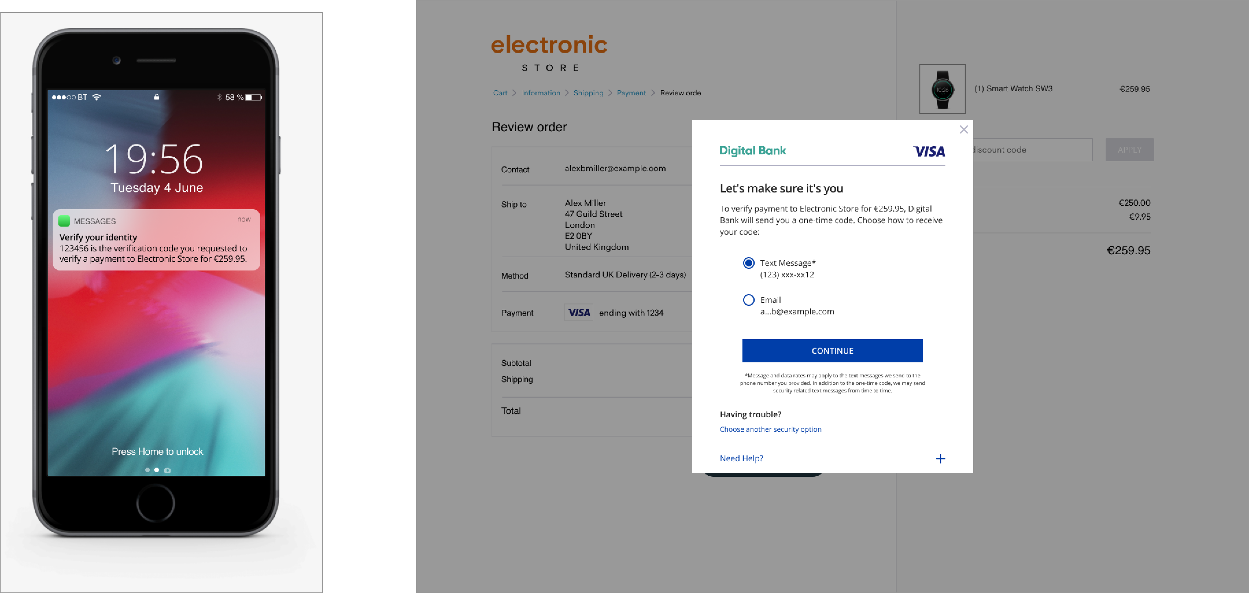
<h2 class="semi-bold">Enter verification code</h2>
<p>We sent you a verification code by text message to (123) xxx-xx12. You have 6 attempts.</p>
<form class="input-code-form sm-80">
<label for="verification-code" class="text-center">Verification code</label>
<input id="verification-code" type="text" maxlength="6" aria-required="true" aria-invalid="false"/>
<p id="verification-code-error" class="meta error error-helper"><span class="visa-icon visa-icon-error-sm" aria-hidden="true"></span>Please enter verification code.</p>
<button id="submit-code-button" type="button" class="button-primary">Continue</button>
<button type="button" class="button-link">Resend code</button>
</form>
</div>
CSS - One Time Passcode Input Field
body {
font-family: "open-sans", sans-serif, Tahoma;
font-size: 12px;
color: #222;
margin: 0;
background-color: lightgray;
}
.semi-bold {
font-family: "open-sans-semi-bold", sans-serif, Tahoma;
}
button, input {
font-family: "open-sans", sans-serif, Tahoma;
}
fieldset {
border: none;
-webkit-margin-start: 0px;
margin-inline-start: 0px;
padding: 0;
}
.meta {
font-size: 12px;
color: #616188;
}
.legal {
font-size: 8px;
line-height: 13px;
}
.text-left {
text-align: left !important;
}
.sm-80 {
width: 100% !important;
margin-left: auto;
margin-right: auto;
}
.text-center {
text-align: center;
display: block;
}
p {
margin-top: 2px;
margin-bottom: 10px;
line-height: 20px;
}
.button-primary {
background-color: #003EA9;
color: white;
text-transform: uppercase;
height: 24px;
border: none;
font-size: 12px;
margin-left: auto;
margin-right: auto;
display: block;
border-radius: 2px;
width: 100%;
}
.button-primary:focus {
outline: 1px dashed #003EA9;
outline-offset: 1px;
}
.link-cta {
text-decoration: none;
display: block;
margin-top: 28px;
color: #0051DC;
}
.sr-only {
border: 0;
clip: rect(0 0 0 0);
height: 1px;
margin: -1px;
overflow: hidden;
padding: 0;
position: absolute;
width: 1px;
}
.dialog {
background: white;
justify-content: center;
width: 100vw;
height: 100vh;
margin: 0px;
position: relative;
}
.dialog .dialog-header {
position: relative;
}
.dialog .dialog-header .close-button {
background-color: transparent;
border: none;
position: absolute;
top: 40px;
right: 30px;
font-size: 14px;
text-transform: uppercase;
}
.dialog .dialog-header .branding-zone {
padding: 44px 0px 14px;
margin: 0 32px;
border-bottom: 1px solid #B4B4C6;
text-align: left;
}
.dialog .dialog-header .branding-zone img.bank-logo {
height: 12px;
}
.dialog .dialog-header .branding-zone img.visa-logo {
height: 12px;
float: right;
}
.dialog .dialog-body {
padding: 10px 32px;
}
.dialog .dialog-body h2 {
font-size: 16px;
margin: 14px 0 12px;
}
.dialog .dialog-body .sec-option-heading {
font-size: 15px;
line-height: 28px;
margin: 25px 0 34px;
padding-top: 25px;
}
.dialog .dialog-body form {
margin: 0 auto;
}
.dialog .dialog-body input[type=text] {
display: block;
border: 1px solid #616188;
border-radius: 2px;
height: 24px;
font-size: 12px;
margin-top: 3px;
margin-bottom: 0px;
margin-left: auto;
margin-right: auto;
text-align: left;
padding: 0px;
width: 100%;
}
.dialog .dialog-body input[type=text].error, .dialog .dialog-body input[type=text] .error:focus {
border-color: #D50000;
outline: none;
}
.dialog .dialog-body label {
color: #616188;
line-height: 20px;
}
.dialog .dialog-body .input-code-form label {
color: #0051DC;
}
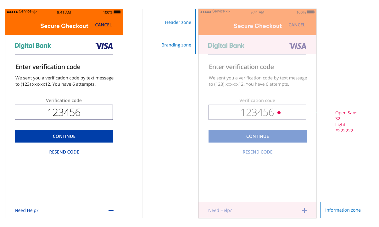
.dialog .dialog-body #verification-code {
height: 48px;
font-size: 32px;
margin-top: 3px;
text-transform: uppercase;
text-align: center;
}
.dialog .dialog-body input[type=checkbox] {
margin-right: 10px;
}
.dialog .dialog-body input[type=checkbox].error, .dialog .dialog-body input[type=checkbox] .error:focus {
outline: 1px solid #D50000;
}
.dialog .dialog-body .error-helper {
display: none;
}
.dialog .dialog-body .error-helper.show {
display: block;
}
.dialog .dialog-body .error-helper span.visa-icon {
margin-right: 4px;
}
.dialog .dialog-body p.error {
color: #D50000;
}
.dialog .dialog-body .radio-group {
display: flex;
margin-bottom: 24px;
}
.dialog .dialog-body .radio-group label {
display: inline;
text-align: left;
color: #222;
}
.dialog .dialog-body .helper-text {
font-size: 9px;
line-height: 20px;
}
.dialog .dialog-body #continue-button, .dialog .dialog-body #question-one-button,
.dialog .dialog-body #submit-code-button, .dialog .dialog-body #kba-continue-button, .dialog .dialog-body #otp-continue-button {
margin-top: 10px;
width: 100%;
}
.dialog .dialog-body #kba-continue-button, .dialog .dialog-body #otp-continue-button {
margin-top: 28px;
}
.dialog .dialog-body .button-link {
background-color: white;
color: #003EA9;
text-transform: uppercase;
height: 40px;
border: none;
padding: 10px;
margin-left: auto;
margin-right: auto;
display: block;
}
.dialog .dialog-body .information-zone {
margin: 28px auto 0px;
}
.dialog .dialog-body .information-zone h3 {
margin: 0;
font-size: 10px;
line-height: 20px;
}
.dialog .dialog-body .information-zone a {
font-size: 10px;
color: #003EA9;
}
.dialog .dialog-body .round-box {
border: 1px #B4B4C6 solid;
border-radius: 8px;
padding: 22px 26px 0 22px;
}
.dialog .dialog-body #another-security-option form {
width: 100%;
}
.dialog .dialog-body .large-80 {
width: 100%;
}
.dialog .dialog-footer {
position: absolute;
width: 100%;
bottom: 0px;
}
.dialog .dialog-footer .accordion-button {
color: #003EA9;
width: 100%;
text-align: left;
border: none;
background-color: white;
padding: 16px 32px;
position: relative;
}
.dialog .dialog-footer .accordion-button .visa-icon {
position: absolute;
top: 20px;
right: 32px;
font-size: 9px;
font-weight: bold;
}
.dialog .dialog-footer .accordion-button:focus {
outline: 1px dotted black;
}
.dialog .dialog-footer .accordion-container {
display: none;
padding: 10px 48px;
background-color: white;
max-height: 80vh;
overflow-y: auto;
}
.dialog .dialog-footer .accordion-container.show {
display: block;
}
/* 250x400 */
@media (min-width: 250px) {
body {
font-size: 12px;
}
.legal {
font-size: 8px;
}
.meta {
font-size: 9px;
}
.button-primary {
height: 24px;
font-size: 12px;
width: 100%;
margin-bottom: 0px;
border-radius: 2px;
}
p {
margin-top: 2px;
margin-bottom: 2px;
line-height: 16px;
}
.dialog .dialog-header .close-button {
top: 8px;
right: 8px;
font-size: 16px;
padding: 0px;
}
.dialog .dialog-header .branding-zone {
padding: 30px 0 4px;
margin: 0 8px;
}
.dialog .dialog-header .branding-zone img.bank-logo {
height: 12px;
}
.dialog .dialog-header .branding-zone img.visa-logo {
height: 12px;
}
.dialog .dialog-body {
padding: 0px 8px;
}
.dialog .dialog-body h2 {
font-size: 16px;
line-height: 28px;
margin: 0px;
}
.dialog .dialog-body .sec-option-heading {
padding-top: 24px;
margin-bottom: 24px;
}
.dialog .dialog-body .information-zone {
margin: 2px auto 0px;
}
.dialog .dialog-body .information-zone h3 {
font-size: 10px;
line-height: 20px;
}
.dialog .dialog-body .information-zone a {
font-size: 10px;
line-height: 16px;
}
.dialog .dialog-body .question-one-form {
padding-top: 12px;
}
.dialog .dialog-body .question-two-form {
padding-top: 10px;
}
.dialog .dialog-body .get-code-form legend {
max-height: 77px;
overflow-y: auto;
margin-bottom: 10px;
}
.dialog .dialog-body .radio-group {
margin-bottom: 10px;
}
.dialog .dialog-body #verification-code {
height: 24px;
font-size: 12px;
}
.dialog .dialog-body #continue-button {
margin-top: 0px;
}
.dialog .dialog-body .round-box {
border: 0px;
padding: 0;
}
.dialog .dialog-footer .accordion-button {
font-size: 9px;
line-height: 20px;
padding: 0 8px;
}
.dialog .dialog-footer .accordion-button .visa-icon {
top: 5px;
right: 8px;
font-size: 9px;
font-weight: bold;
}
.dialog .dialog-footer .accordion-container {
padding: 10px 8px;
font-size: 9px;
line-height: 16px;
}
}
/* 390x400 */
@media (min-width: 390px) {
body {
font-size: 12px;
}
.legal {
font-size: 8px;
}
.button-primary {
height: 24px;
font-size: 12px;
margin-bottom: 0px;
}
p {
line-height: 20px;
}
.sm-80 {
width: 80% !important;
}
.dialog .dialog-header .close-button {
top: 8px;
right: 8px;
font-size: 16px;
padding: 0px;
}
.dialog .dialog-header .branding-zone {
padding: 30px 0 4px;
margin: 0 8px;
}
.dialog .dialog-header .branding-zone img.bank-logo, .dialog .dialog-header .branding-zone img.visa-logo {
height: 12px;
}
.dialog .dialog-body {
padding: 0px 8px;
}
.dialog .dialog-body h2 {
font-size: 16px;
line-height: 28px;
margin: 0px 0 8px;
}
.dialog .dialog-body .sec-option-heading {
font-size: 16px;
padding-top: 24px;
margin-bottom: 24px;
}
.dialog .dialog-body .information-zone {
margin: 2px auto 0px;
}
.dialog .dialog-body .information-zone h3 {
font-size: 10px;
line-height: 20px;
}
.dialog .dialog-body .information-zone a {
font-size: 10px;
line-height: 16px;
}
.dialog .dialog-body .radio-group {
margin-bottom: 10px;
}
.dialog .dialog-body form.security-options {
width: 100%;
}
.dialog .dialog-body .round-box {
padding: 26px 34px 15px;
border: 1px #B4B4C6 solid;
}
.dialog .dialog-body .security-options-container {
padding: 0 22px;
}
.dialog .dialog-body #question-one-button, .dialog .dialog-body #question-two-button {
margin-bottom: 10px;
}
.dialog .dialog-body #another-sec-option-screen-otp {
padding-left: 14px;
padding-right: 14px;
}
.dialog .dialog-body .get-code-form legend {
max-height: 66px;
}
.dialog .dialog-footer .accordion-button {
font-size: 9px;
line-height: 20px;
padding: 0 8px;
}
.dialog .dialog-footer .accordion-button .visa-icon {
top: 5px;
right: 8px;
font-size: 9px;
font-weight: bold;
}
.dialog .dialog-footer .accordion-container {
padding: 10px 8px;
font-size: 9px;
line-height: 16px;
}
}
/* 500x600 */
@media (min-width: 500px) {
body {
font-size: 14px;
}
p {
line-height: 20px;
}
.legal {
font-size: 9px;
}
.meta {
font-size: 12px;
}
.button-primary {
height: 40px;
font-size: 14px;
margin-bottom: 16px;
}
.dialog .dialog-header .close-button {
top: 8px;
}
.dialog .dialog-header .branding-zone {
padding: 44px 0 14px;
margin: 0 35px;
}
.dialog .dialog-header .branding-zone img.bank-logo, .dialog .dialog-header .branding-zone img.visa-logo {
height: 20px;
}
.dialog .dialog-body {
padding: 0px 35px;
}
.dialog .dialog-body h2 {
font-size: 16px;
line-height: 28px;
margin: 12px 0 16px;
}
.dialog .dialog-body .question-one-form {
padding-top: 22px;
}
.dialog .dialog-body .get-code-form {
padding-bottom: 16px;
}
.dialog .dialog-body .get-code-form legend {
max-height: 63px;
}
.dialog .dialog-body .information-zone h3 {
font-size: 14px;
line-height: 20px;
}
.dialog .dialog-body .information-zone a {
font-size: 12px;
line-height: 16px;
}
.dialog .dialog-body #verification-code {
height: 48px;
font-size: 24px;
}
.dialog .dialog-body input[type=text] {
height: 38px;
font-size: 24px;
}
.dialog .dialog-body .security-options-container {
padding: 0px;
}
.dialog .dialog-body #another-sec-option-screen-otp {
padding-left: 0px;
padding-right: 0px;
}
.dialog .dialog-body .helper-text {
font-size: 14px;
}
.dialog .dialog-body #submit-code-button {
margin-bottom: 0px;
}
.dialog .dialog-footer .accordion-button {
font-size: 12px;
line-height: 20px;
padding: 16px 32px;
}
.dialog .dialog-footer .accordion-button .visa-icon {
top: 20px;
right: 32px;
font-size: 13px;
font-weight: bold;
}
.dialog .dialog-footer .accordion-container {
padding: 10px 35px;
font-size: 12px;
line-height: 16px;
}
}
/* 600x400 */
@media (min-width: 576px) {
body {
font-size: 12px;
}
p {
line-height: 20px;
}
.legal {
font-size: 8px;
}
.meta {
font-size: 9px;
}
.button-primary {
height: 24px;
font-size: 12px;
margin-bottom: 0px;
}
.dialog .dialog-header .branding-zone {
margin: 0 105px;
padding: 27px 0px 4px;
}
.dialog .dialog-header .branding-zone img.bank-logo, .dialog .dialog-header .branding-zone img.visa-logo {
height: 12px;
}
.dialog .dialog-header .close-button {
top: 8px;
right: 88px;
padding: 0px;
}
.dialog .dialog-header .close-button .visa-icon {
display: block;
}
.dialog .dialog-body {
padding: 0px 105px;
}
.dialog .dialog-body h2 {
font-size: 16px;
line-height: 28px;
margin: 0px 0 8px;
}
.dialog .dialog-body .sec-option-heading {
margin: 12px 0;
padding-top: 12px;
}
.dialog .dialog-body .link-cta {
font-size: 10px;
}
.dialog .dialog-body input[type=text] {
height: 24px;
font-size: 12px;
}
.dialog .dialog-body .information-zone {
margin: 12px auto 0px;
}
.dialog .dialog-body .information-zone h3 {
font-size: 10px;
}
.dialog .dialog-body .information-zone a {
font-size: 10px;
}
.dialog .dialog-body .question-one-form {
padding-top: 10px;
}
.dialog .dialog-body .question-two-form {
padding-top: 5px;
}
.dialog .dialog-body .get-code-form {
padding-bottom: 2px;
}
.dialog .dialog-body .get-code-form legend {
max-height: 63px;
}
.dialog .dialog-body .radio-group {
margin-bottom: 10px;
}
.dialog .dialog-body .security-options-container {
padding: 0 20px;
}
.dialog .dialog-body #verification-code {
height: 24px;
font-size: 12px;
}
.dialog .dialog-body #another-sec-option-screen-otp {
padding-left: 20px;
padding-right: 20px;
}
.dialog .dialog-body .helper-text {
font-size: 9px;
}
.dialog .dialog-footer .accordion-button {
font-size: 9px;
padding: 4px 105px;
}
.dialog .dialog-footer .accordion-button .visa-icon {
top: 6px;
right: 108px;
}
.dialog .dialog-footer .accordion-container {
padding: 10px 105px;
font-size: 9px;
line-height: 13px;
}
}
/* Full Screen */
@media (min-width: 768px) {
body {
font-size: 14px;
}
p {
line-height: 20px;
}
.legal {
font-size: 9px;
line-height: 13px;
}
.meta {
font-size: 12px;
line-height: 16px;
}
.button-primary {
height: 40px;
font-size: 14px;
margin-bottom: 0px;
}
.dialog .dialog-header .branding-zone {
margin: 0 75px 0 35px;
padding: 44px 0px 15px;
}
.dialog .dialog-header .branding-zone img.bank-logo, .dialog .dialog-header .branding-zone img.visa-logo {
height: 20px;
}
.dialog .dialog-header .close-button {
top: 8px;
right: 35px;
padding: 0px;
}
.dialog .dialog-header .close-button .visa-icon {
display: block;
}
.dialog .dialog-body {
padding: 0px 75px 0 35px;
}
.dialog .dialog-body h2 {
font-size: 16px;
line-height: 28px;
margin: 12px 0 8px;
}
.dialog .dialog-body .sec-option-heading {
margin: 24px 0;
padding-top: 24px;
}
.dialog .dialog-body form.security-options {
padding-top: 0;
}
.dialog .dialog-body input[type=text] {
height: 38px;
font-size: 24px;
}
.dialog .dialog-body .button-link {
font-size: 14px;
}
.dialog .dialog-body .get-code-form {
padding-top: 10px;
}
.dialog .dialog-body .get-code-form legend {
margin-bottom: 10px;
max-height: 80px;
overflow-y: auto;
}
.dialog .dialog-body .question-one-form {
padding-top: 22px;
}
.dialog .dialog-body .question-two-form {
padding-top: 16px;
}
.dialog .dialog-body .input-code-form {
padding-top: 20px;
}
.dialog .dialog-body .first-question {
margin-bottom: 18px;
display: block;
}
.dialog .dialog-body input[type=text] {
border-radius: 1px;
margin-bottom: 9px;
}
.dialog .dialog-body .large-80 {
width: 80%;
margin-left: auto;
margin-right: auto;
}
.dialog .dialog-body #question-two-button {
margin-top: 6px;
}
.dialog .dialog-body #continue-button {
margin-top: 8px;
margin-bottom: 16px;
}
.dialog .dialog-body #question-one-button {
margin-top: 28px;
margin-bottom: 28px;
width: 100%;
}
.dialog .dialog-body #submit-code-button {
margin-top: 18px;
}
.dialog .dialog-body #verification-code {
height: 48px;
font-size: 24px;
}
.dialog .dialog-body .link-cta {
font-size: 14px;
}
.dialog .dialog-body .information-zone {
margin: 12px auto 0px;
}
.dialog .dialog-body .information-zone h3 {
font-size: 14px;
}
.dialog .dialog-body .information-zone a {
font-size: 12px;
}
.dialog .dialog-body .answer-input-group {
margin-top: 22px;
}
.dialog .dialog-body .radio-group {
margin-bottom: 20px;
}
.dialog .dialog-body .security-options-container {
padding: 0px;
}
.dialog .dialog-body #another-sec-option-screen-otp {
padding-left: 0px;
padding-right: 0px;
}
.dialog .dialog-body .helper-text {
font-size: 14px;
}
.dialog .dialog-footer .accordion-button {
font-size: 12px;
padding: 10px 75px 10px 35px;
}
.dialog .dialog-footer .accordion-button .visa-icon {
top: 15px;
right: 75px;
}
.dialog .dialog-footer .accordion-container {
padding: 10px 75px 10px 35px;
font-size: 12px;
line-height: 13px;
}
}
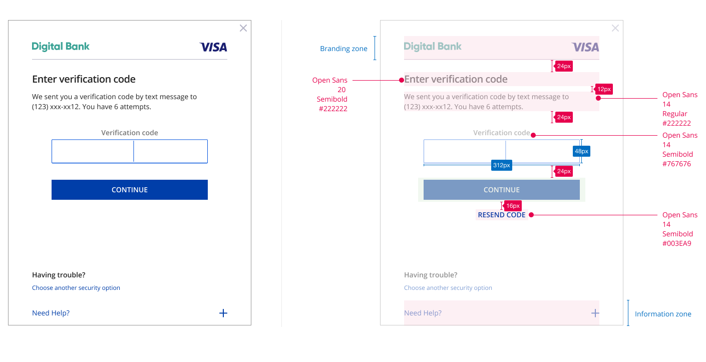
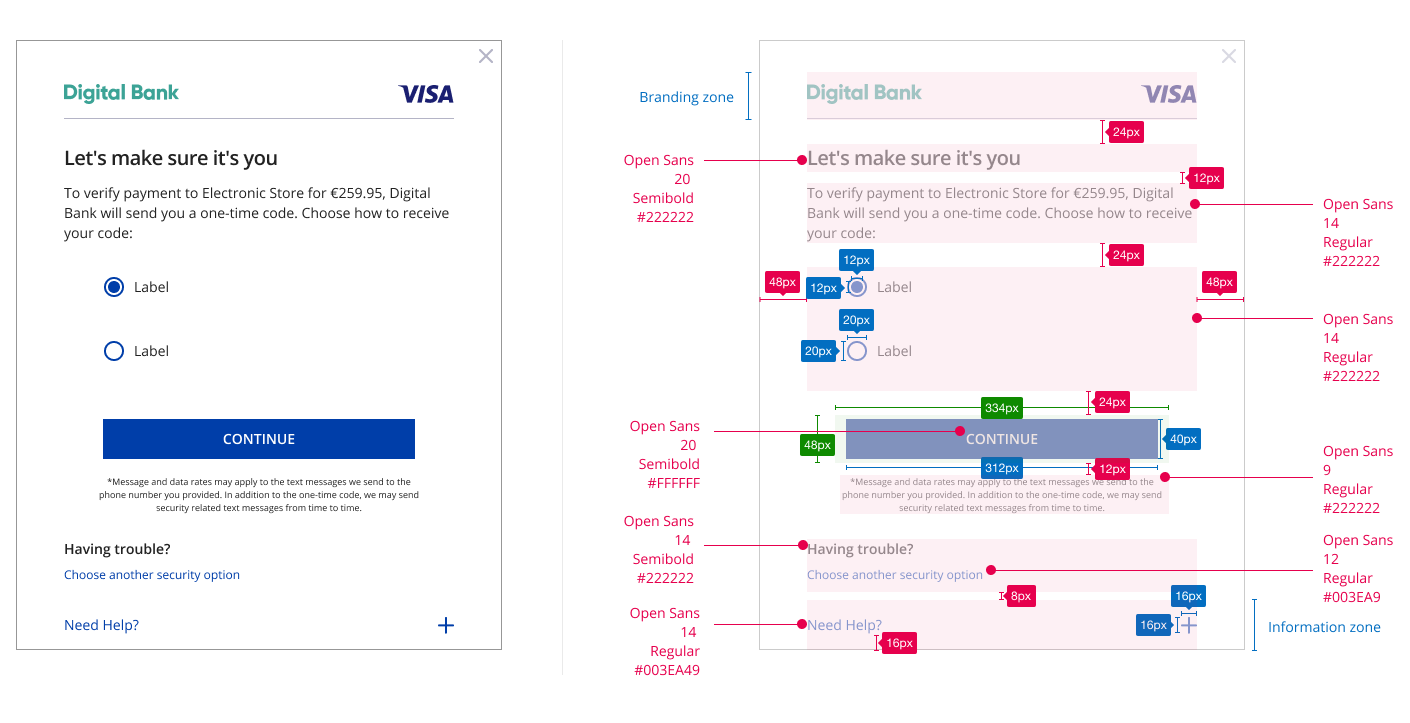
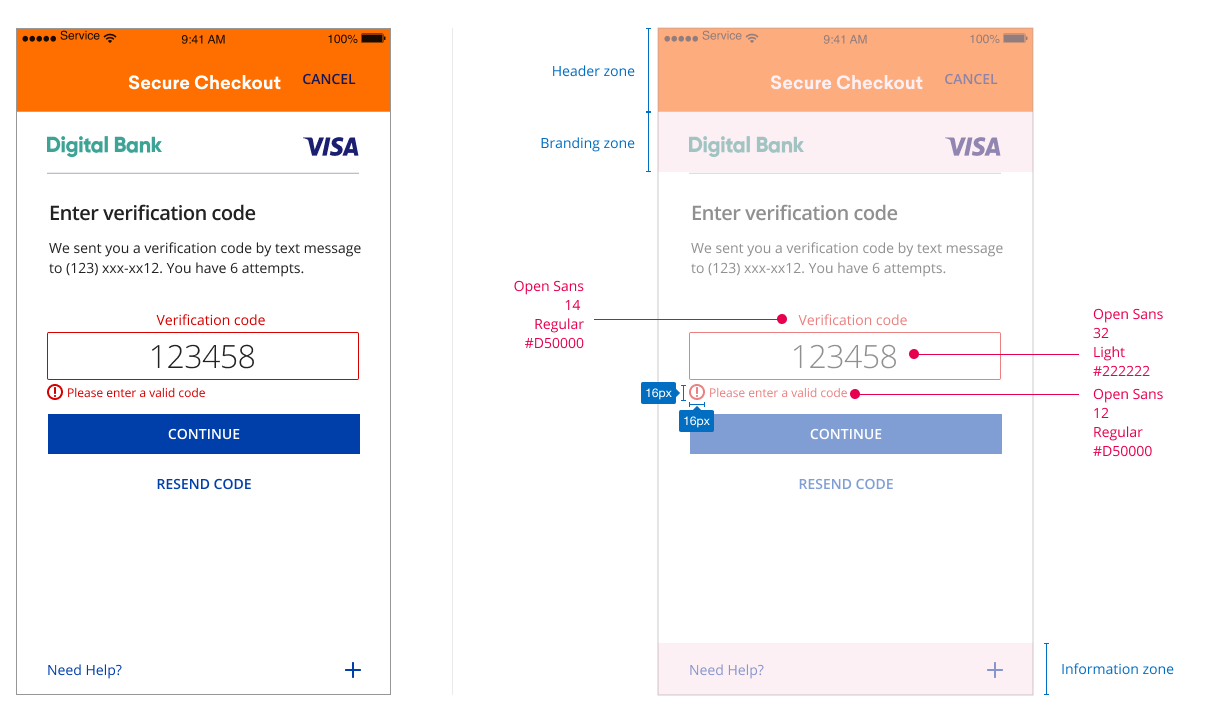
UX Elements
Data Elements from EMV 3DS specification |
Content/Requirement |
CSS Styles |
|---|---|---|
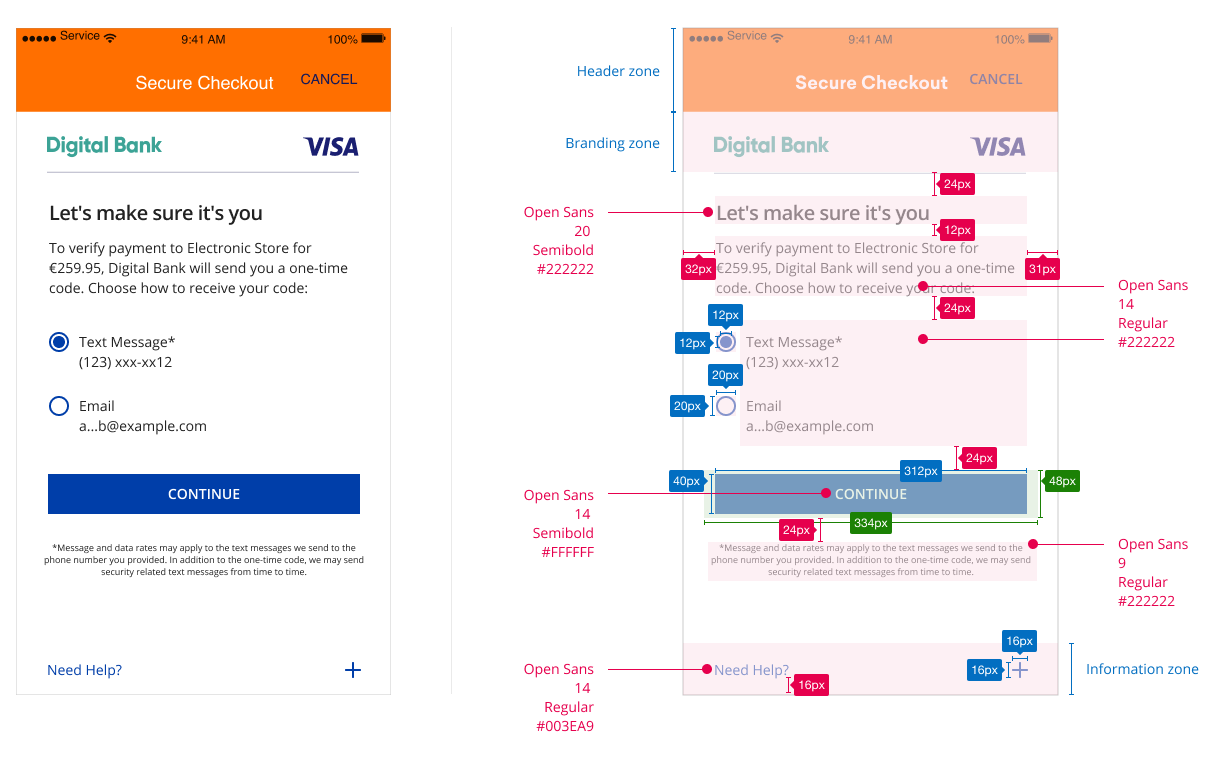
| Challenge Information Header OTP Choice Screen |
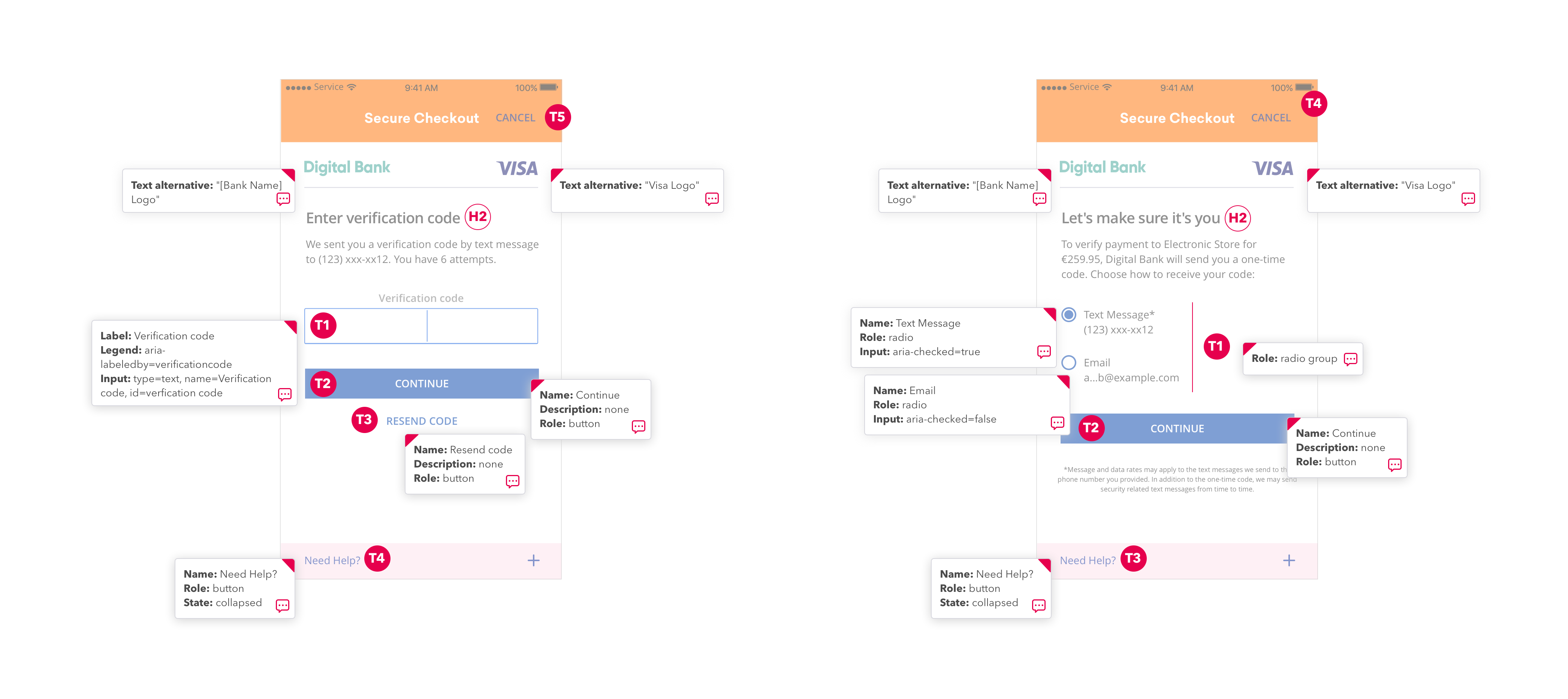
The page must display the headline Let's make sure it's you above the Challenge Info text for OTP Choice Screen. |
|
| Challenge Information Text OTP Choice Screen |
To verify payment to Electronic Store for (amount), (Issuer Name) will send you a one-time code. Choose how to receive your code: Radio Button: Text Message* <<masked phone number>> Radio Button: Email <<masked email>> |
|
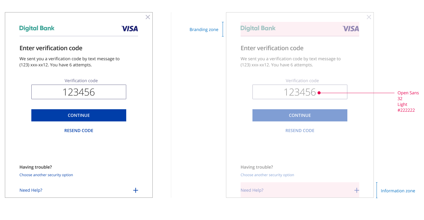
| Challenge Information Header OTP Code Entry |
The page must display the headline Enter verification code above the Challenge Info text. |
|
Challenge Information Text OTP Code Entry |
This text must include the following language: OTP by SMS: We sent you a verification code by text message to <<masked phone number>>. You have 6 attempts. OTP by Email: We sent you a verification code to <<masked email address>>. You have 6 attempts. The merchant name, purchase currency & purchases amount as incuded in the AReq message. |
|
Challenge Information Label |
The display name for this field must be ‘Verification code’. |
|
Challenge Information Data Entry |
Input Box |
|
Submit Authentication Label |
A form element that should align with the center of the bottom margin displaying “Continue”. |
|
Resend Information Label |
The display name for this field must be ‘Resend Code’. A form element that should vertically align with the center of the bottom margin. |
|
Why Information Label |
Display the Why Information Label as a graphical control element that can be expanded. The display name for this field must be ‘Need Help?’. |
|
Why Information Text |
Display the Why Information Text only when the user selects the “Need Help? Label”. Text provided by the Issuer to be displayed to the cardholder to explain why the cardholder is being asked to perform the authentication task. |
|
Desktop Browser
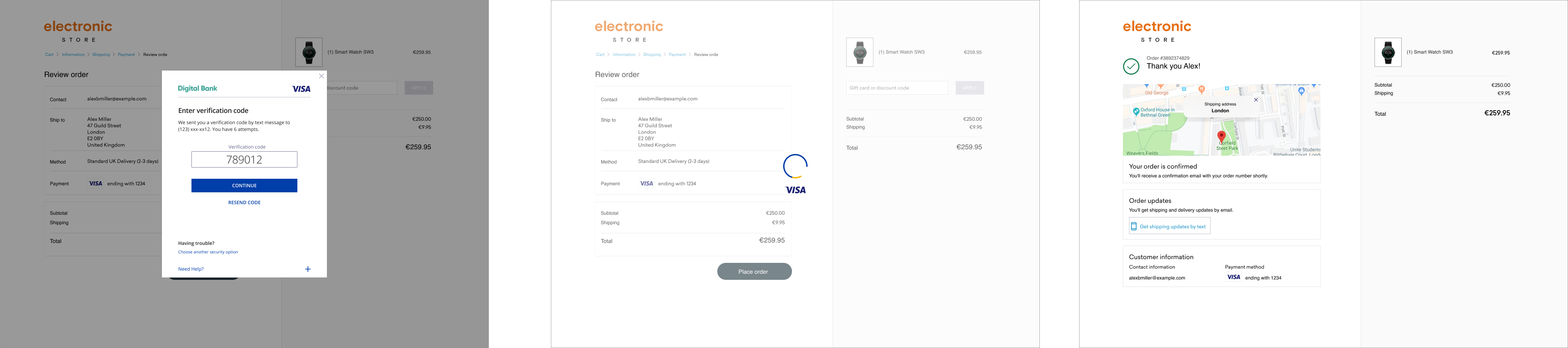
In this use case, the customer initiates a 3DS transacion from a desktop browser. See below for the authentication challenge user experience.
Element |
Accessibility Guidelines |
|---|---|
Headline |
|
Challenge Information Text |
|
Submit Authentication Label |
|
Use Another Method |
|
Need Help Field |
|
Code Entry |
|
Passcode Entry Field |
|
Resend Information Label |
|
UX Elements
Element |
Content/Requirement |
CSS Styles |
|---|---|---|
OTP Choice Screen |
The page must display the headline Let's make sure it's you above the Challenge Info text for OTP Choice Screen. To verify payment to Electronic Store for (amount), (Issuer Name) will send you a one-time code. Choose how to receive your code:
Radio Button: Text Message* <<masked phone number>>
Radio Button: Email <<masked email>> |
Headline
Body
Radio Button
|
OTP Code Entry Screen |
The page must display the headline Enter verification code above the Challenge Info text. This text must include the following language: OTP by SMS: We sent you a verification code by text message to <<masked phone number>>. You have 6 attempts.
OTP by Email: We sent you a verification code to <<masked email address>>. You have 6 attempts.
The merchant name, purchase currency, & purchases amount as included in the AReq message. |
Headline
Body
|
Passcode Entry Field |
The display name for this field must be ‘Verification code’ above an Input Box. |
|
Submit Authentication Field |
A form element that should align with the center of the bottom margin displaying “continue”. |
|
Resend Information Field |
The display name for this field must be ‘Resend Code’. Challenge Information is resent to the customer. A form element that should vertically align with the center of the bottom margin. |
|
Need Help Field |
The display name for this field must be ‘Need Help?’. Display the “Need Help?’ Label as a graphical control element that can be expanded. Display the Need Help Text only when the user selects the Need Help Label. Text provided by the Issuer to be displayed to the cardholder to explain why the cardholder is being asked to perform the authentication task. |
|
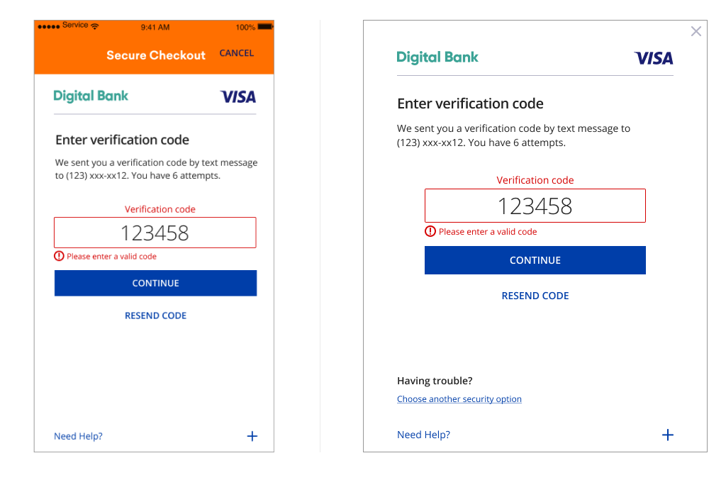
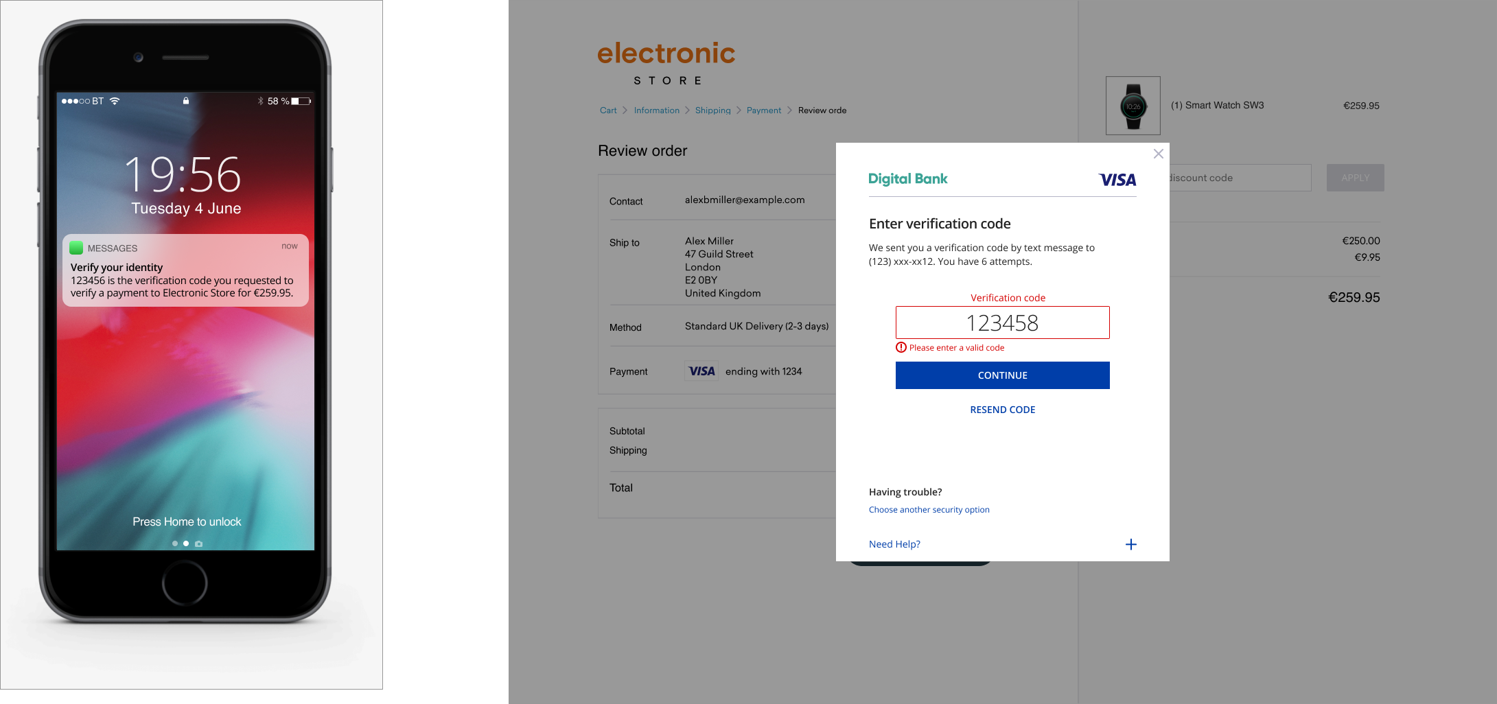
Error Flows
Incorrect Code Entered
View PDF of screens seen in this full flow here
Element |
Accessibility Guidelines |
|---|---|
Code Entry |
|
Passcode Entry Field |
|
Submit Authentication Label |
|
Resend Information Label |
|
Use Another Method |
|
Need Help Field |
|
The One-time Passcode SMS/Email Browser Requirements are displayed until cardholder inputs verification code then follow below for incorrect input:
Element |
Content/Requirement |
CSS Styling |
|---|---|---|
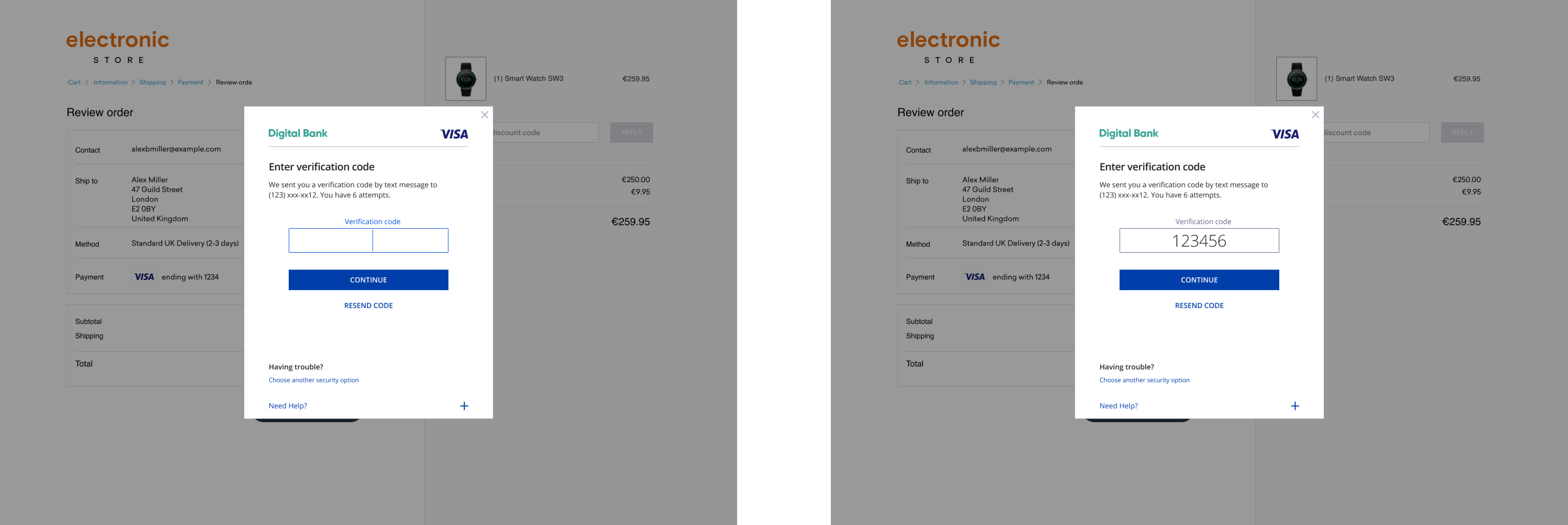
Passcode Entry Field |
The display name for this field must be ‘Verification Code’ above an Input Box. The display name below the input box must be ‘Please enter a valid code’. |
Verification Code
Please enter a valid code
|
Submit Authentication Label |
A form element that should align with the center of the bottom margin displaying “Continue”. |
|
Resend Information Label |
The display name for this field must be ‘Resend Code’. Challenge Information is resent to the customer. A form element that should vertically align with the center of the bottom margin. |
|
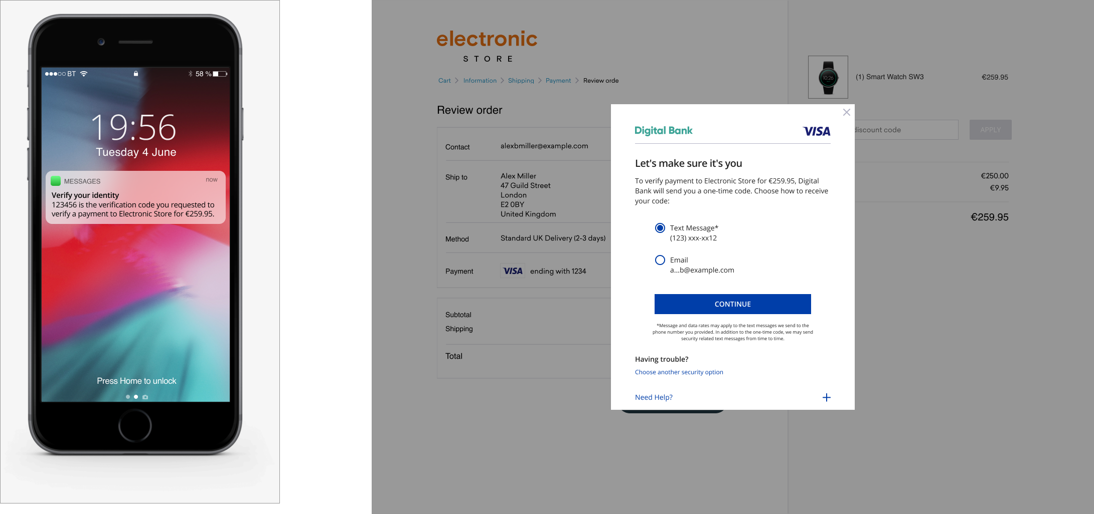
Use Another Authentication Method (for Desktop Browser) |
The display name for this field must be ‘Having Trouble?’. Display “Choose Another Security Option’ Label. A new screen must be displayed if this option is clicked on with another authentication method option (See Backup Authentication Method Section). |
Having Trouble?
Choose Another Security Option
|
Resend Code
View PDF of screens seen in this full flow here

Maximum Number of Attempts Exceeded
In order to protect customers from fraud risk, we recommend that a customer only be allowed to attempt to complete an authentication challenge a maximum of five (5) times. See below for the user experience in which a customer exceeds the maximum number of authentication attempts allowed.
Element |
Accessibility Guidelines |
|---|---|
Information Text |
|
Go Back Label |
|
The One-time Passcode SMS/Email Browser Requirements are displayed until cardholder reaches the Max Number of Attempts, then follow below:
Element |
Content/Requirement |
CSS Styling |
|---|---|---|
Information Header |
The page must display the headline Verification Failed above the Max Number of Attempts language. |
|
Information Text |
Oops! You have reached the maximum number of attempts. Please try again. |
|
Button Label |
A form element that should align with the center of the bottom margin displaying “Go Back”. |
|
QR Code
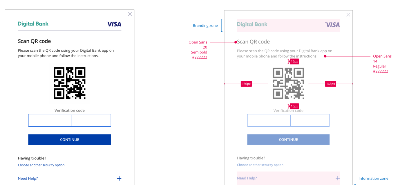
One-time passcodes may be delivered by issuers to their cardholders via a variety of methods. QR code-driven OTP authentication may be used as a backup authentication method.
Element |
Content/Requirement |
CSS Styling |
|---|---|---|
QR Code |
The page must display the headline Scan QR Code above QR Code. Please scan the QR code using your {Issuer Name} app on your mobile phone and follow the instructions. Show QR Code to scan.[BP1] |
Header
Body
QR Code
|
Passcode Entry Field |
The display name for this field must be ‘Verification Code’ above an Input Box. |
|
Submit Authentication Label |
A form element that should align with the center of the bottom margin displaying “Continue”. |
|
Use Another Authentication Method |
The display name for this field must be ‘Having Trouble?’. Display “Choose Another Security Option’ Label. A new screen must be displayed if this option is clicked on with another authentication method option (See Backup Authentication Method Section). |
Having Trouble?
Choose Another Security Option
|
Need Help Label |
The display name for this field must be ‘Need Help?’. Display the “Need Help?’ Label as a graphical control element that can be expanded. |
|
Need Help Text |
Display the Need Help Text only when the user selects the Need Help Label. Text provided by the Issuer to be displayed to the cardholder to explain why the cardholder is being asked to perform the authentication task. |
|
Legal Disclaimer
Important Information on Copyright and Disclaimers
© 2022 Visa. All Rights Reserved
Notice: The trademarks, logos, trade names and service marks, whether registered or unregistered (collectively the “Trademarks”) are Trademarks owned by Visa. All other trademarks not attributed to Visa are the property of their respective owners, are used for identification purposes only and do not imply product endorsement or affiliation with Visa.
Note: This document is not part of the Visa Core Rules and Visa Product and Service Rules. In the event of any conflict between any content in this document, any document referenced herein, any exhibit to this document, or any communications concerning this document, and any content in the Visa Core Rules and Visa Product and Service Rules, the Visa Core Rules and Visa Product and Service Rules shall govern and control.
Note: Please note that the screens are for illustrative purpose only.
DISCLAIMERS: THIS DOCUMENT IS PROVIDED ON AN "AS IS,” “WHERE IS,” BASIS, “WITH ALL FAULTS” KNOWN AND UNKNOWN. TO THE MAXIMUM EXTENT PERMITTED BY APPLICABLE LAW, VISA EXPLICITLY DISCLAIMS ALL WARRANTIES, EXPRESS OR IMPLIED, REGARDING THE LICENSED WORK AND TITLES, INCLUDING ANY IMPLIED WARRANTY OF MERCHANTABILITY, FITNESS FOR A PARTICULAR PURPOSE, AND NON-INFRINGEMENT OF THIRD-PARTY INTELLECTUAL PROPERTY RIGHTS.